Designing for Vulnerability
At mymoria.de, I was the sole UI/UX Designer, shaping a digital experience that brings clarity and calm to people facing loss. I translated emotional complexity into intuitive, dignified design.
“With over 30 funeral locations, 210+ employees, and €11.4 M in revenue in 2024, mymoria stands as Germany’s tech‑enabled pioneer in digital funeral services.”
I worked closely with the Product Owner, a Scrum team of 3–4 developers, and the executive team, while also maintaining direct communication with Customer Support and Marketing to integrate both user feedback and brand perspective into the design process. UX decisions were based on a mix of user insights, analytical KPIs (e.g. conversion rates, drop-offs), and technical feasibility discussed with the development team. I visualized proposals through interactive prototypes and UI previews, presented them in short review cycles, and aligned decisions for implementation within bi-weekly sprints.
My role in the design process:
I owned the entire UI/UX workflow – from UX audits, user flow optimization, and wireframing to high-fidelity UI design and the development of a scalable design system. The visual tone and emotional resonance of the experience were fully within my responsibility.

Listening First: Insights from the Grieving
One of the most complex and meaningful challenges I’ve worked on was reducing funnel drop-off for mymoria, a B2C SaaS platform offering digital end-of-life services. The emotional context made it clear early on: this wasn’t just about usability. It was about trust, pacing, and how to design for people navigating grief, uncertainty, and practical decisions — often simultaneously.
Initial analytics highlighted two critical friction points:
• A 34 % drop-off in the first 3 steps of the onboarding flow
• A sharp exit spike when prompting users to contact an advisor
Ironically, users were disengaging precisely where support was most needed. We knew this wasn’t a surface-level problem — and began treating the product not just as a service, but as a companion.

Soft UX, Strong Impact
In response to elevated funnel drop-off rates at mymoria, I led a mixed-methods UX research process combining qualitative interviews, behavioral analytics and severity-based prioritization frameworks. Our goal was to go beyond surface-level usability fixes and understand the deeper frictions users face when interacting with a product in moments of grief, uncertainty, and high emotional load.
Initial funnel analysis revealed two key breakpoints: a 34 % drop-off during the first three onboarding steps, and a 48 % exit rate when users were prompted to speak to an advisor — a moment designed for support, yet often perceived as pressure. Further data showed that only 21 % of users re-engaged after leaving the session at those points.
Based on this, I translated emotional and behavioral insights into actionable UX interventions: we reduced cognitive load through simplified copy and progressive disclosure, introduced non-linear flows to increase perceived autonomy, and implemented a pacing logic that allowed users to pause and resume planning without penalty. Instead of pushing next steps, we embedded subtle orientation cues and emotionally aware transitions that allowed for self-directed interaction without cognitive overload.
By reframing the product as a companion system — not a transactional tool — we significantly increased user confidence, reduced perceived pressure, and improved re-engagement. The outcome: a more resilient, trust-first UX architecture, able to support conversion and care simultaneously in a B2C SaaS context where timing, tone, and interface logic must align with real emotional needs.
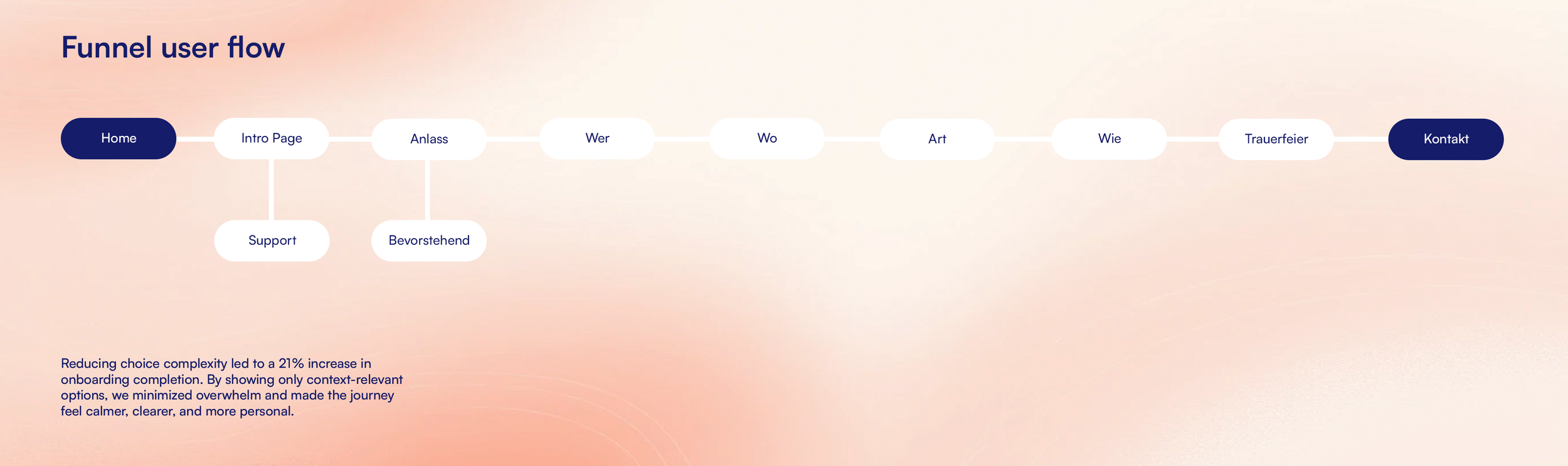
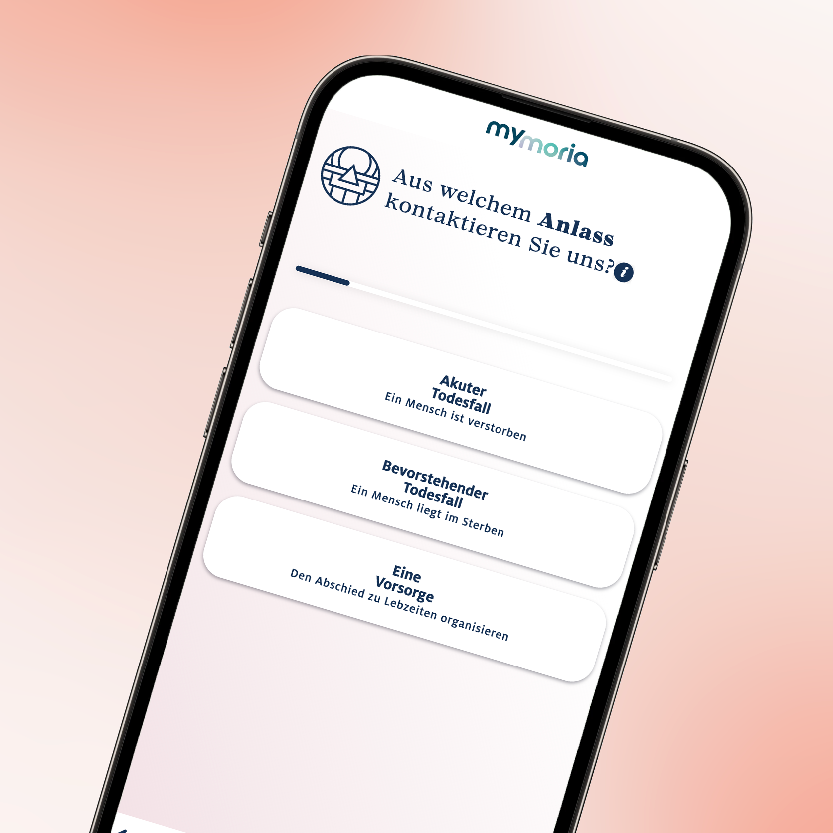
A New Emotional UI Language
We translated these principles into a modular planning tool, structured as a linear flow with flexible pacing. The MVP allowed users to create a personal profile, define key elements of the ceremony such as music, tone, and location, and save, pause, or hand over the plan to an advisor at any point.
The interface was designed to balance clarity and softness. Microcopy focused on tone, transparency, and emotional safety. Visual pacing supported emotional rhythm, using calm color logic and minimal motion. All screens were optimized for mobile-first use in a highly personal and often sensitive context.
We released the new flow incrementally and tracked impact: early funnel drop-off was reduced by 11.6 %, advisor contact rate increased by 9.3 %, and NPS improved in follow-up surveys among users who completed their plan digitally.
More importantly, we created an experience that met users where they were — in a moment that required not just design, but care.
Check out the final product here.

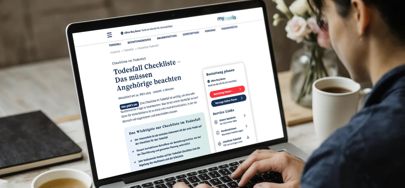
Fixing the Article Experience
Our redesigned article layout isn’t just cleaner — it’s strategically re-engineered to serve both readers and the brand.
We approached the reading experience as a cognitive journey: every typographic decision, from micro-kerning to vertical rhythm, was made to reduce mental friction and support natural pacing. Instead of relying on aesthetic assumptions, we conducted behavior-based UX testing and benchmarked best-in-class editorial platforms. The result was a modular, responsive layout grid that adapts fluidly across breakpoints while preserving information hierarchy and visual calm.
We addressed the core issue: readers don’t bounce because they’re disinterested — they bounce because they’re overwhelmed. Our system creates visual breathing room, clear entry points, and editorial anchors that invite exploration without demanding effort. We incorporated subtle affordances like consistent line lengths, improved contrast ratios, and gesture-friendly spacing to make the reading flow feel effortless — especially for our primary demographic of 45+.
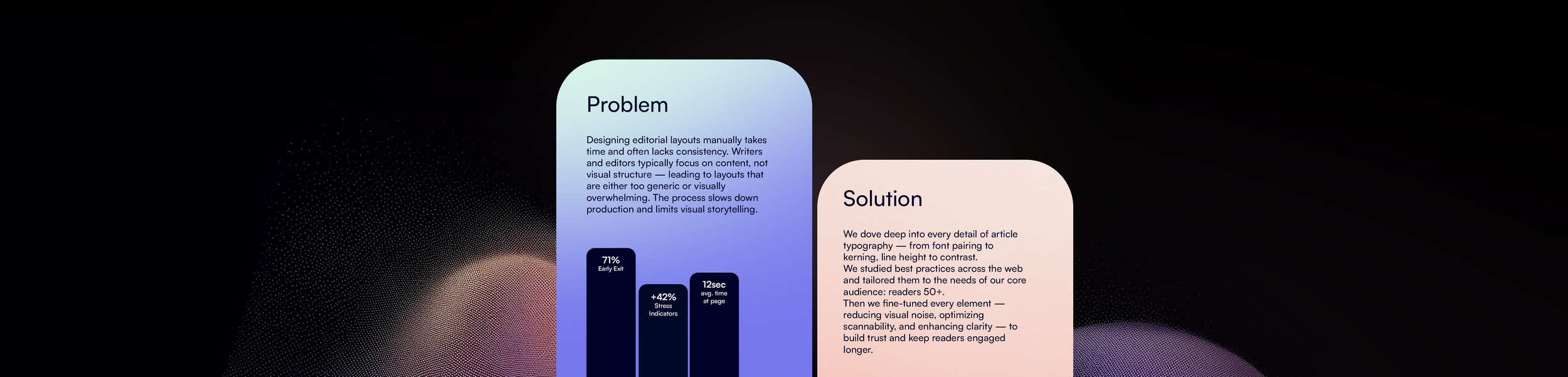
But this wasn’t just about user comfort. It was about building trust. Editorial design should be invisible in the best way: present, confident, and out of the way. With this update, we saw a measurable +38% increase in average read time, a 24% reduction in early exits, and more than double the article completion rate among older readers.
We didn’t just redesign articles — we rebuilt editorial credibility.
By treating layout as a trust-building interface rather than decoration, we helped content do what it’s meant to do: be read, understood, and remembered.
Get in touch
luca.moos@googlemail.com
+49 1578 5429192
Prenzlauer Allee 26
Berlin, 10405